“All we want for Christmas is traffic”, this slightly modified version of Mariah Carey’s Christmas evergreen could be the anthem of eCommerce enthusiasts these days. As it is, most shop owners put a lot of effort (and money) in SEO and SEM but neglect to focus on important on-site issues such as product presentation in result pages.
What we can learn from SERP usability rules.
We all know how important it is to be in the first 3 to 4 listings in Google’s result pages. But not only does this hold true for SERPs but for any shop-search as well. Once a visitor gets results from your site-search the most important thing is to offer the right AND available product. In Jakob Nielson’s post “Scrolling and Attention” he explains that according to his research “80 % of the users are checking ‘above the fold’ only.”. I don’t think that his findings reflect all online-shops. But still, knowing this is key in prioritizing what visitors should find on your online-shop’s result pages.
First things first – products on top get the highest attention.
- Top-sellers and revenue boosters should always be placed on top, while sale items and bad sellers should be below the fold or on the next page.
- Make sure to show only deliverable products, because nothing is more frustrating for a customer than finding out that the just-found-present takes 5 weeks to deliver.
- Use an intelligent result system that incorporates information like relevance, top sellers and availability status, to avoid frustration and to turn more visitors into buyers.
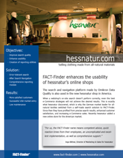
[PDF-File] Learn more about usability in online-shops in our case study: Hessnatur Usability.

Christmas-Conversion the New Post: Are you placing your top sellers on top of your search result list? http://bit.ly/da8WCg #eCommerce
“All we want for Christmas is traffic”, this Christmas evergreen could be the anthem of eCommerce enthusiasts http://bit.ly/blE9xf
RT @fact_finder: Are you placing your top sellers on top of your search result list? http://bit.ly/da8WCg
RT @fact_finder New Post: Are you placing your top sellers on top of your search result list? http://bit.ly/da8WCg #eCommerce
RT @fact_finder: Are you placing your top sellers on top of your in-shop search results? http://bit.ly/da8WCg