There are lots of reasons for using list or grid view in your online shop. But in which cases is it more profitable to use grid instead of list view? When does the list view perform the best? We have gathered some tips for displaying the search results for the online shop visitors.
1. Details in lists, pictures in grids
In order to understand which view to choose, firstly let’s point out the difference between them. List view contains a picture of the product on the left side of the screen and some product information (including price, product description, availability etc.) on the right side of the picture.
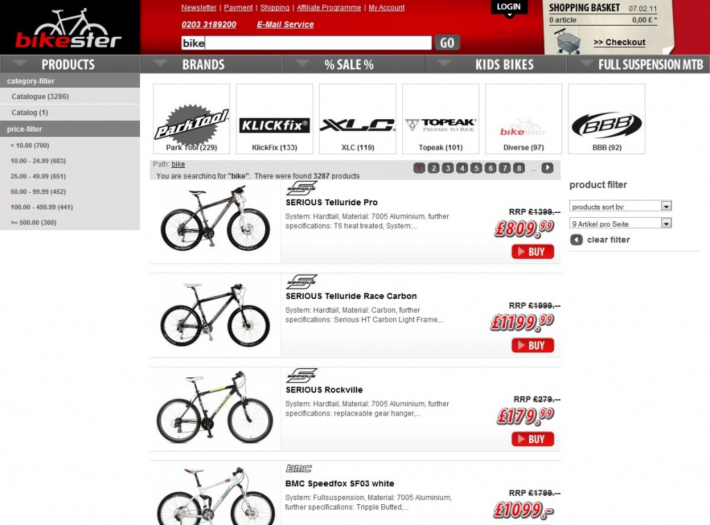
Example: list view (Source: Bikester.com)
Grid view displays product images without lots of additional information – the only description that the shop visitor can see is the product’s name and its price.
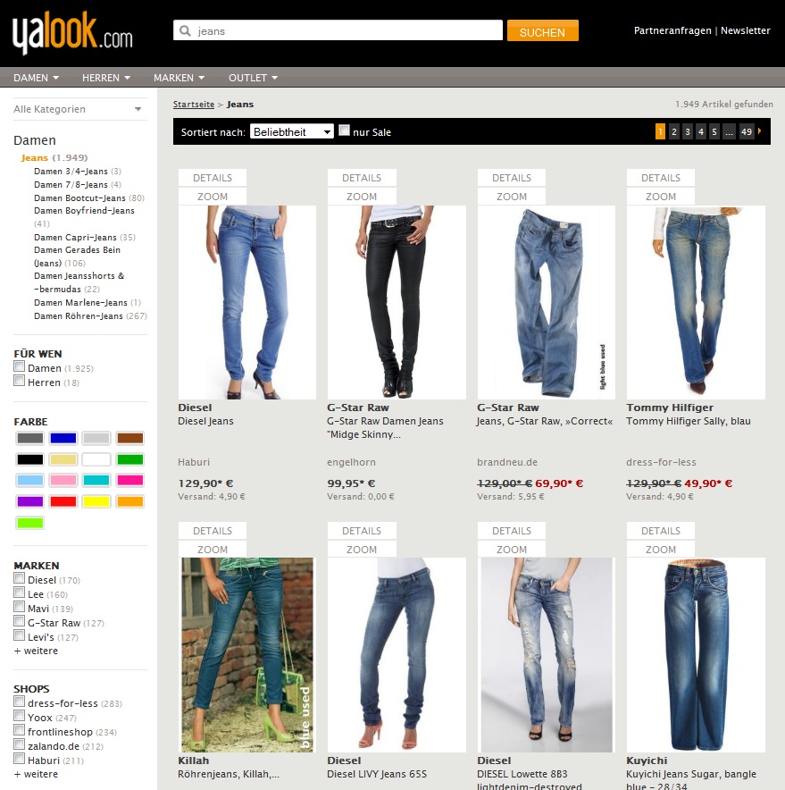
Example: grid view (Source: Yalook.com)
How did result displaying websites change during the last years and what’s hot in that field? Firstly, the quality and amount of the pictures on the product detail page has increased noticeably. Other trends such as technology for presenting the product in a 360° view, zooming function, product videos etc. make online shopping nowadays more comfortable and enjoyable for the users.
2. Make sure to set the right focus on relevance
Since they have a choice of different result displays, shop visitors usually react differently to the depicted products. Sometimes they choose to view several products, sometimes they only click on one picture.
So which view performs the best? Which view can stimulate the visitors to look for more products? The answer is: it depends. FACT-Finder has recently held a survey regarding the behavior of online shoppers by letting them browse in various online shops while being observed with an eye-tracking camera. The goal was to track the searching behavior of the people who are intending to buy something online. This survey depicted some interesting results: the shop visitors react differently when having two different views in front of their eyes.
When dealing with the list view, the attention of online shoppers decreases from top to bottom.
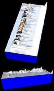
In the list view attention decreases from top to bottom
But when it comes to the grid view the attention tends to be spread more evenly.
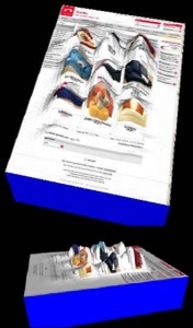
In the grid view attention is spread more evenly
Well, almost more evenly… People tend to pay attention to the pictures with other people rather than to the ones with only products.
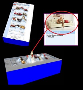
People tend to pay attention to the pictures with other people
For instance, a picture of a sofa with a woman sitting on it catches much more attention than just single-standing sofas presented in the grid view. That’s why keep in mind that people will always catch some attention away from your products.
3. Put your upselling products on the first page
Not only this factor influences the attention of your potential customers. In order to raise their interest to your products in the result view, keep in mind that only 22% of your shop visitors have a look at the second page of the search results. It means that placing the most relevant products on the first page is extremely important to favour the purchasing of your goods.
4. Switch or not switch between views?
In order to respond to different target groups, lots of shop systems allow switching between the list and grid views per standard. In case you have a possibility to embed a “display switch” option to your online shop, firstly answer the question if your shoppers will notice this option and if they will finally switch the views even if they notice the switch button. The shop visitor is king – he wants to see the results that HE percepts as optimal immediately, and in the view that is mostly comfortable for him. And when the results don’t respond to the expectations, the visitors just bounce from your website.
5. Your visitor’s attention is limited
If you don’t have an opportunity to switch between the two views – think about what kind of products you offer and how could promote them better. Which view is mostly relevant for which trading sector? If you need to display a lot of detailed information about the product, e.g. for technical items, – choose the list view. If you sell products that are more emotional (like e.g. fashion), you should better implement the grid view.
The amount of displayed products also depends on your trading focus. The option of choosing an amount of the results is not crucial to have. But if you decide to implement it in your online shop – be aware that the visitor’s attention is limited. That is why displaying your most relevant products on the first result page is once again very important.
6. Test and measure conversion
Speaking about the result views, the choice is not limited to only grid or list ones. You can experiment and for instance include additional information (such as customer ratings or „product video available“) in your product view. This will help you to distinguish yourself from your competition, will provide a better description of the products, is more likely to stay in the minds of your visitors – and, as a result, will push your sales.
Read more
Are you placing your top sellers on top of your search result list?