Our new back-end brings together powerful functionality and elegant visuals, helping FACT-Finder users achieve their goals while providing a great user experience.
At FACT-Finder, we are constantly working to improve the online experience for both retailers and shoppers. During the last months, our research and development team has been hard at work creating new tools for e-commerce, actively filing to patent our latest innovations. Two of our most recent technologies, FACT-Finder Next Generation and the Predictive Basket, have already helped retailers achieve higher revenue.
Now, our team is diligently working on the user interface. In order to accurately map the workflow and make the system intuitive, we have been in constant dialogue with more than 100 users. We are very excited to share with you a sneak preview of our up-and-coming user operating system.
Learn more about the exciting new changes below.
1. Search diagnosis becomes central tool for optimization
When it comes to optimizing search results, the functions concerning search diagnosis are extremely important – which is why it’s at the core of the back-end. Users can now easily understand why a product is in a certain position and how this positioning is decided, whether it’s influenced by ranking rules, campaigns or field weighting. By providing this information in an easy-to-view format, users have a clear idea of what they need to do in the FACT-Finder back-end to increase the visibility of certain products.
2. Side-by-side comparison of rankings
The new search diagnosis provides users with access to all the optimization tools from one central location. Campaigns, Thesaurus, ranking rules and more can be quickly accessed through the new layout. Additionally, two search results can be viewed side by side within one window – greatly simplifying comparisons and testing.
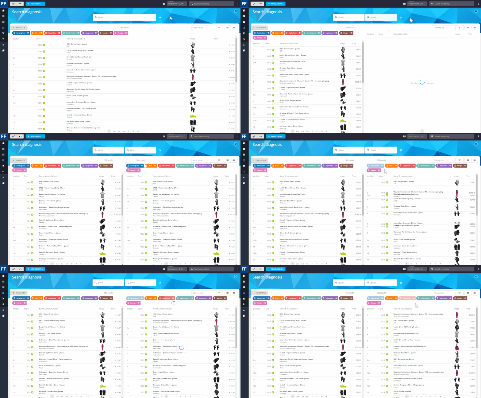
Get immediate feedback on settings changes through side-by-side comparisons. Be one of the first to experience FACT-Finder’s new UI. Contact us to see a live demonstration of the Best Site Search Solution 2020:

3. All active rules and campaigns at a glance
Colored tags help to quickly indicate all the campaigns and ranking rules that apply to the corresponding search results. You can directly adjust these from within the search diagnosis by clicking on the tag and editing the settings.
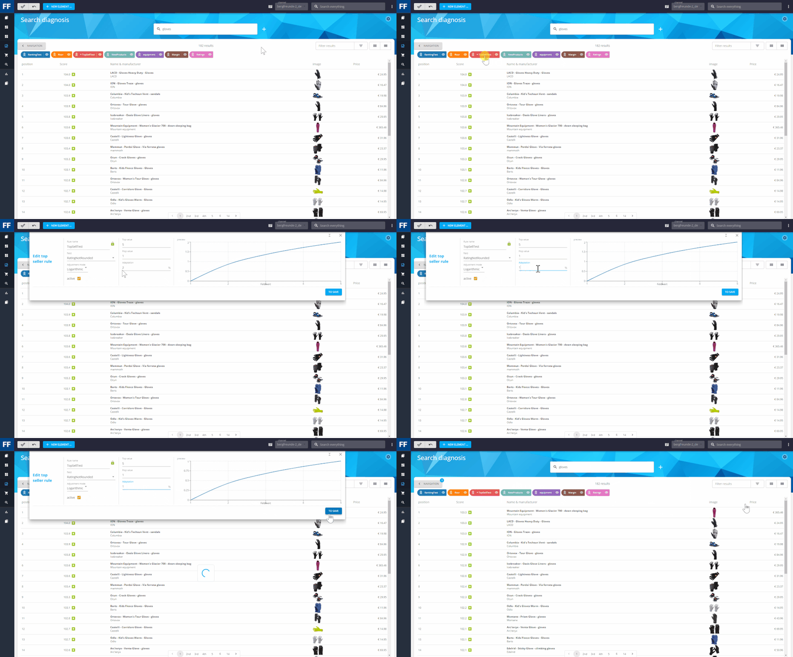
Adjust rules or campaigns for search terms faster than ever before.4. Sanity check – immediately see if something is wrong
Learning from mistakes is good, avoiding them altogether is better. To enable newcomers to get quickly started, we have built a “sanity check” into the new UI. For example, if a setting has been added during the current session but it does not match the search term, the system will automatically gray it out. This helps the user immediately notice if, for example, a campaign trigger is not set correctly or a ranking adjustment has not been saved.
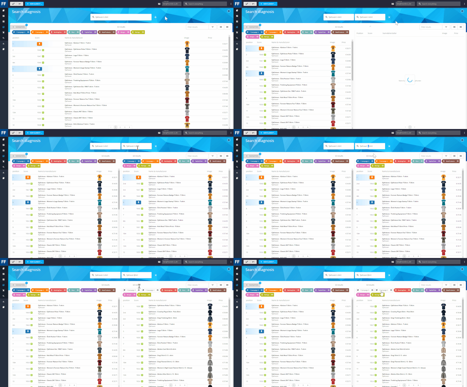
A sanity check quickly identifies problem areas, making it easy for you to recognize and take action.5. Pin Product campaigns – quick re-sorting via drag and drop
You no longer need to create campaigns when you want to highlight specific products in the search results. Now, you can just simply drag and drop the product to the desired position in the search diagnosis. FACT-Finder will then automatically create a campaign in the background, aka a Pin Product campaign. After you have pinned a product in this way, you can of course adjust all campaign parameters.
This new feature makes it tempting to arrange the search results just the way you want them. However, we recommend that you only use this function for single, quick optimizations. FACT-Finder’s ranking rules and general settings provide much more efficient and sustainable tools for global adjustments. And remember that FACT-Finder learns from every search and continually optimizes it.
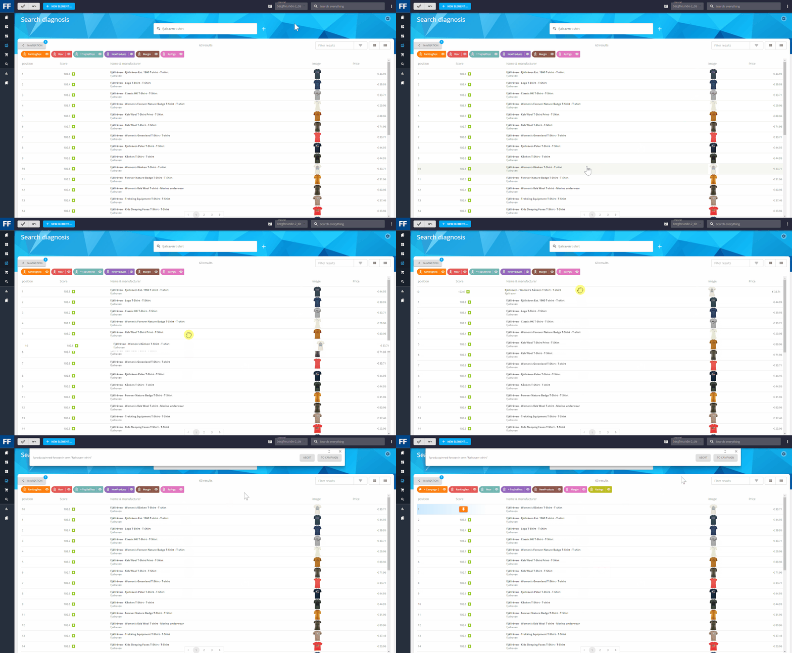
Pin Product campaigns are the fastest way to organize a product’s position by ‘pinning’ it. 6. Build your own dashboard
The majority of users who were surveyed reported that they regularly use the What’s Hot report, which provides valuable information about several predefined measurement figures including the most frequent search queries and zero results searches. Since it is so popular with our customers, the new dashboard is based on it.
The goal was to maintain the usability and clarity of the What’s Hot report while enhancing it with configurable widgets. KPIs can now be added, removed and arranged individually, allowing users to organize everything based on their needs. The dashboard provides a quick and helpful overview, while FACT-Finder Analytics provides detailed evaluations.
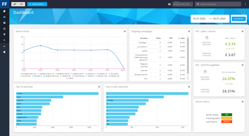
What are customers searching for? What items are they not finding? How are my KPIs developing?
Get the answers to all your questions at a glance through your personal FACT-Finder Dashboard. 7. Validate and control product lists for campaigns
Many users also explained that when setting up FACT-Finder campaigns, they are given a list of article numbers from their product team. Most of these campaigns are pushed product campaigns which can, for example, arrange 50 items within the search results in order or priority.
To make managing campaigns simple and transparent, users can now see missing products or unsorted product lists and take immediate action.
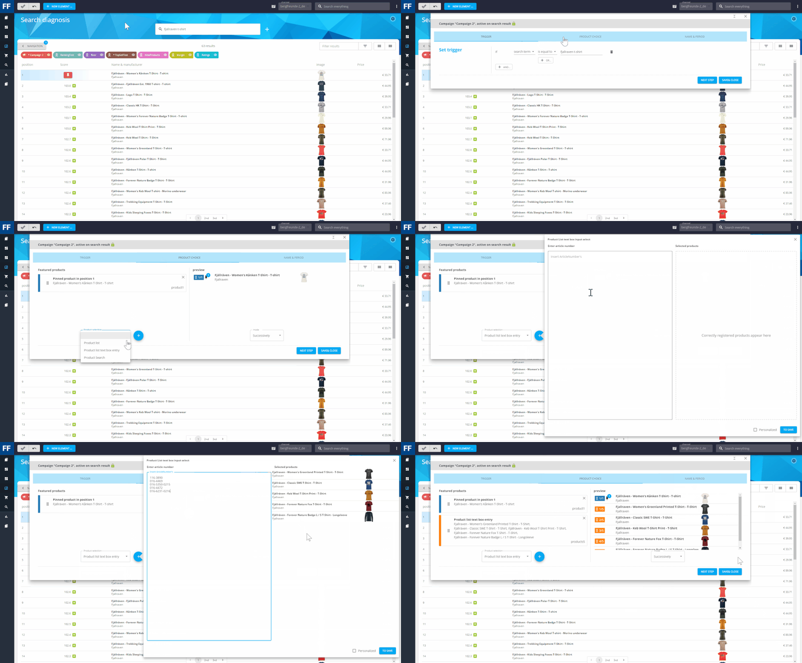
The featured products function now lets you preview product lists using article numbers. Checking product data has never been easier.8. Discover Thesaurus chains
FACT-Finder’s Thesaurus function is used extensively by our customers – some have even defined more than one thousand synonyms. With such a large number, there is often unintentional overlapping of synonyms, also called thesaurus chains. For example, one user defined ‘Nike’ and ‘Reebok’ as synonyms, but also ‘Reebok’ and ‘camping’. As a result, search queries for Nike products showed camping products. FACT-Finder now warns of these thesaurus chains with users receiving a notice in the user interface (keyword: sanity check). Thesaurus chains do make sense in some scenarios and are needed, which is why FACT-Finder allows them.
Watch to learn how our FACT-Finder’s intelligent backend helps Seefelder’s eCommerce team. “These are things that make our lives easierand save resources in development.” – Achim Schneider.
▶ Watch the full video
9. New user interface based on React
Thanks to the switch to React technology, FACT-Finder’s user interface can now be updated, adapted and optimized faster. React is a declarative, efficient, and flexible JavaScript library for building user interfaces. Its state-of-the-art components make launching new features and system testing easier than ever before. This will enable us to incorporate customer feedback into the user interface over the coming months.
New usability saves time and creates transparency
We are eagerly looking forward to the new release. In Q3 we will go into direct exchange with users and have out beta version put through its paces by customers. We want to thank users for sharing their insights with out product management team and we are confident that FACT-Finder users will love the new features.