Experience faceted search from the customers’ POV and learn methods you can implement now to deliver an effortless filtering experience.
Faceted search is one of the most important tools for online shoppers and for a remarkable user experience. When implemented well, they ensure that customers can easily find their way through product results. And yet in many online stores, faceted search is anything but simple to use. Too often, shoppers are presented with too many, not enough, repetitive or irrelevant options.
To illustrate, let’s look at the example below. Visitors searching for houseplants have two very different experiences depending on the online shop. The first retailer displays only two filters: brand and price range, which are not really suitable for this product type or a category this broad. By not providing customers a faceted search that helps them easily find the plant they‘re looking for, customers are forced to scroll and scroll – most likely abandoning the site. The second shop, however, focuses on providing truly helpful facets. This retailer recognizes that product specifications such as plant type, leaf color and sun exposure are more valuable in leading visitors to their desired houseplant faster.
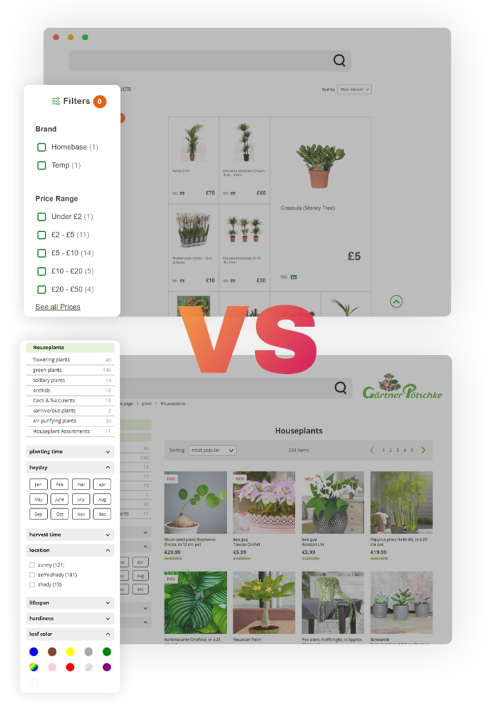 Faceted search can deliver an outstanding user experience when done right.
Brand and price range are not constructive in finding the right houseplant, but plant type, sunlight and color are.
Usability hurdles like the example above are more common than you might think. In fact, the Baymard Institute, a renowned research institution in the field of web UX, analyzed the 123 top-grossing US and European eCommerce sites. They found the average site to perform mediocre at best, and 36% of sites to have such severe design and feature flaws that it was downright harmful to their users’ ability to find and select products. Read Baymard’s Product Lists UX research report.
In this article, we’ll show you how to implement faceted search properly using best practice examples to help you improve your customers’ experience and increase your conversion.
What is faceted search?
Definition: Faceted search, also known as faceted filtering or faceted navigation, is a function in online shops that helps users refine results by applying filters from product attributes. Filters enable one-dimensional narrowing of results, for example by brand or color. Faceted search, on the other hand, includes multiple filters simultaneously, allowing users to apply several product characteristics at the same time, in this case, brand and color. This makes faceted search especially helpful for large assortments with many product characteristics.
See faceted search from the customer’s POV
Explore the digital customer journey of two of Europe’s leading supermarkets, Asda and Lidl, when making a simple search for wine. Watch to learn how to make finding the right products very easy.
9 best practices (with examples) for faceted search
1. Standardize your product data
This best practice is at the top of the list with good reason. That’s because the faceted search is created from product data. This means that the more structured and well-maintained the underlying data is, the better the facets will be on the front-end.
In the real world, however, good product data is hard to come by. Often the causes of inconsistent data, which render facets redundant, begin with the suppliers. When it comes to describing products, manufacturers strive to outdo each other with creative ideas. Standard colors such as red and blue become evocative creations, such as ‘volcano’ and ‘deep ocean’. Yes, these names do sound more intriguing, but as a retailer, you should stick to basic colors when possible.
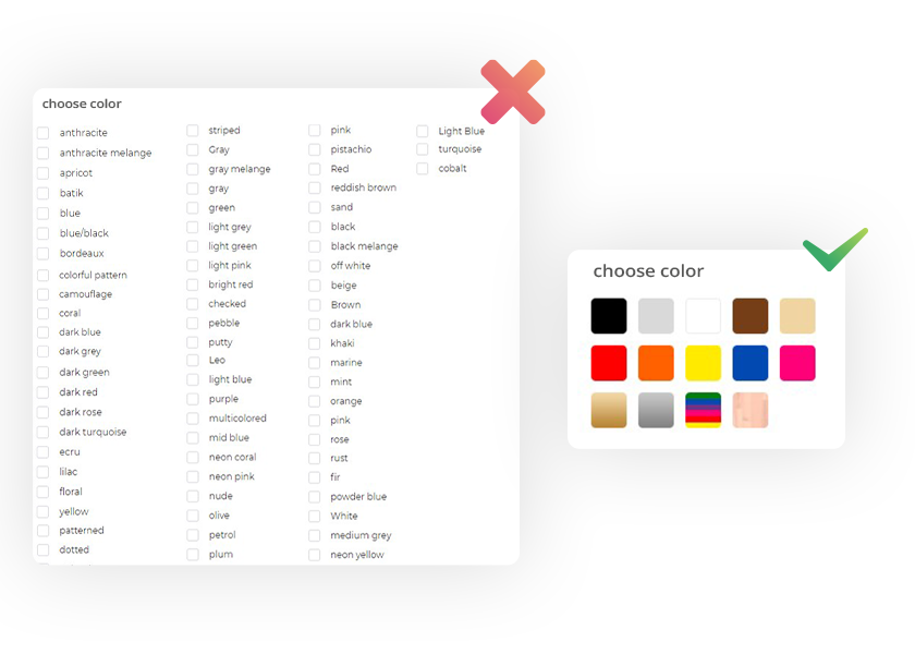 Rather than displaying a massive list of colors by name, group them into basic color groups for easier selection.
Suppliers don’t always follow the same formatting, but you can still achieve a clear, uniform faceted search by standardizing your product data. This unifies inconsistent spelling in product characteristic fields, such as 230V vs. 230 V or aluminium vs. aluminum. Regarding the example of colors, we recommend that you additionally write the standard name in the filter-relevant field of your data feed. No worries, you can still use the fancy name in the product description.
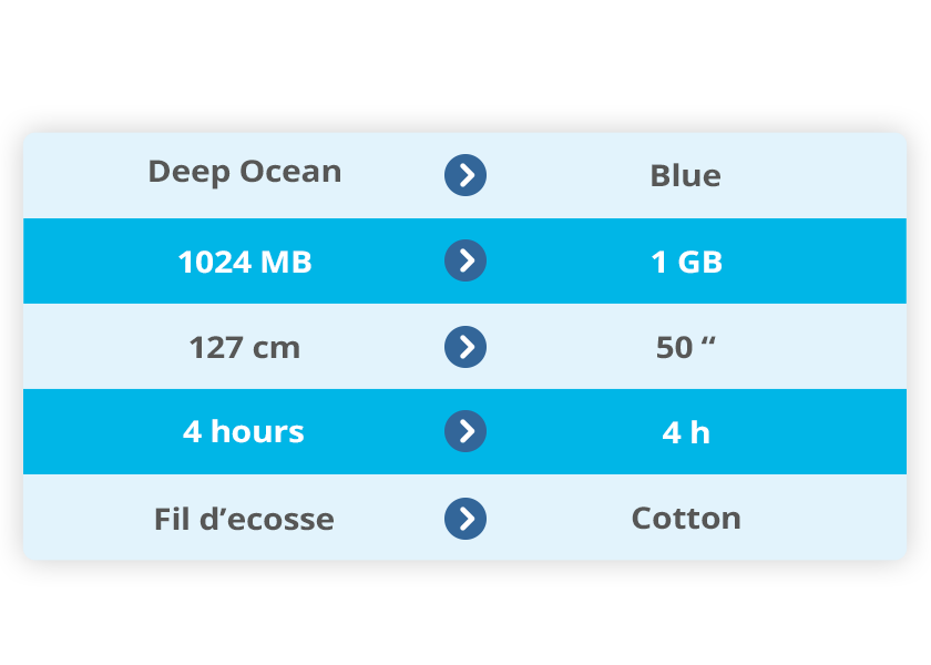 In order to avoid facet attributes repeating, it’s best to standardize your product data. This will avoid customers having to select multiple duplicate options.
2. Create more clarity through interdependent facets
Especially with a broad range of products, interdependent facets can significantly improve user-friendliness. By this, we mean that certain filters are only displayed after a pre-selection has been made. Or simply said, facets don’t appear until they’re necessary.
For example, a visitor in an online store for sports clothing searches for ‘Nike’. It’s not yet clear which product category they have in mind, therefore, the results will include shoes as well as clothing and accessories. Without interdependence in your faceted search, all possible facets now appear, including sizes for clothes. But if the customer is looking for Nike shoes, t-shirt sizes are completely irrelevant at this stage of the customer journey and only take up unnecessary space. It’s, therefore, better to display shirt sizes only after the user has filtered ‘t-shirt’ as the category.
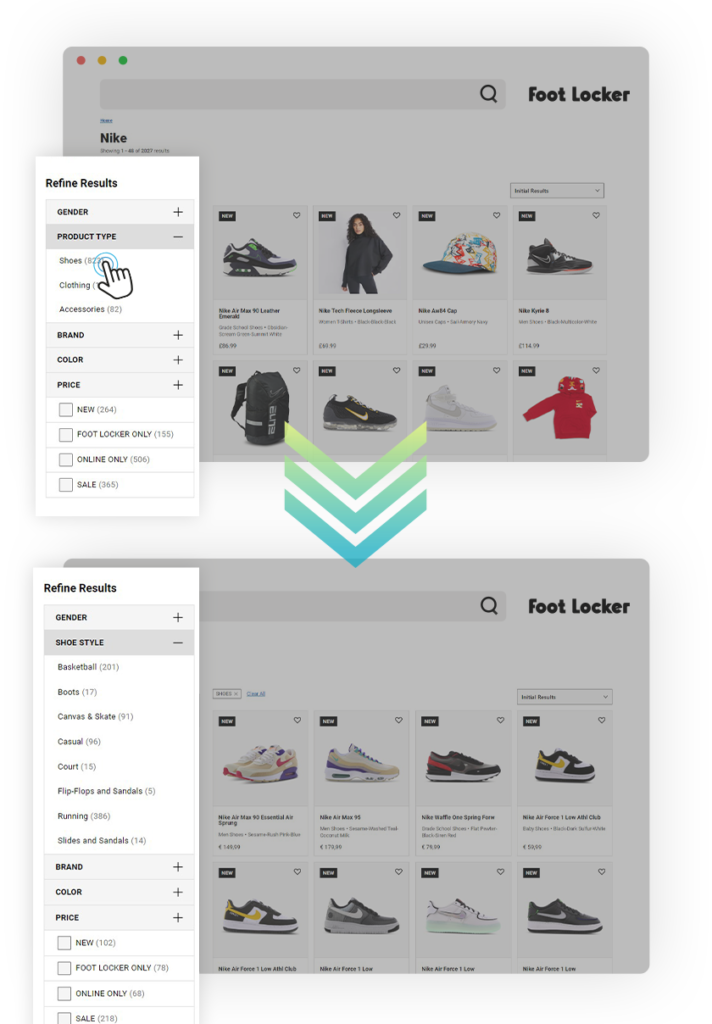 Only after customers click on product type do more specific facets appear. This way, the faceted search remains clear at first and then expands with exactly the options the online shopper needs.
On a technical level, such dependencies can be implemented in a matter of minutes. What is crucial here is good planning and design. If you need support on this topic, contact us. Our experts are happy to help you.
3. Add thematic facets
What are customers’ motives for shopping in your store and your categories? The more precisely you can answer this question, the more you can help them. Thematic facets are exactly what they sound like – a way to filter based on a specific theme.
Examples of thematic facets can be:
- occasion for women’s dresses: party, gala, work, vacation
- intended use of laptops: office, gaming, family
- price-sensitive purchases: remaining stock, winter sales, last-minute deals
The possibilities are endless. What’s important is that thematic facets are useful to customers and add value to their experience. Then, they work not only as a conversion lever but also as a real unique selling point for your business.
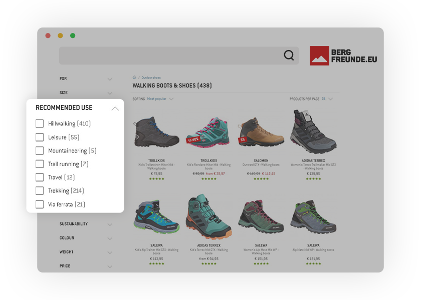 Visitors searching for walking boots at Bergfreunde will find facets for the exact area of use – an enormous help in speeding up product selection.
4. Use graphics and sliders in addition to checkboxes
Everything that makes your faceted search more interactive and visually appealing will have a positive effect on the user experience. Of course, a faceted search should only be displayed in a special way if it makes sense. A few best practices are displaying colors with tiles and brand names with logos.
Two more examples of best practices are price sliders and product images.
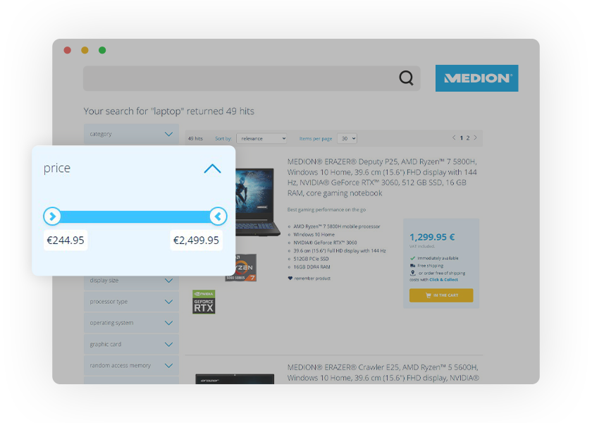 Medion uses a simple price slider that saves customers from having to enter numerical values.
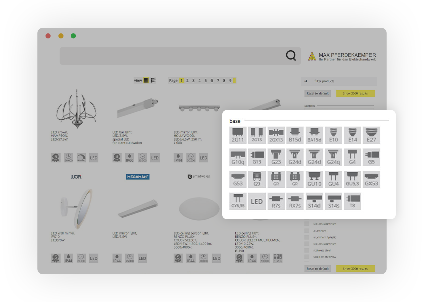 Max Pferdekaemper makes it easy for online shoppers to find the right light bulb by using images. Customers can simply compare the base they have to the one they see online and voila!
5. Arrange the order of facets based on your customers
The same principle that applies to products applies to facets: the most relevant should be at the top. The criteria by which customers prefer to filter by are very much dependent on the product concerned. For example, the width of the screen is one of the most important decision-making details for televisions and computer monitors. On the other hand, for SLR cameras, which also have a screen, the focus will be on completely different factors. Therefore, the facet ‘screen size’ should appear higher for TVs and lower for cameras.
In the backend of your faceted search solution, you should be able to control everything related to the sorting and order of the facets. FACT-Finder users will find these settings under Basic Settings > Filter/Navigation > Order. Here, the facets can be arranged with a simple drag and drop function.
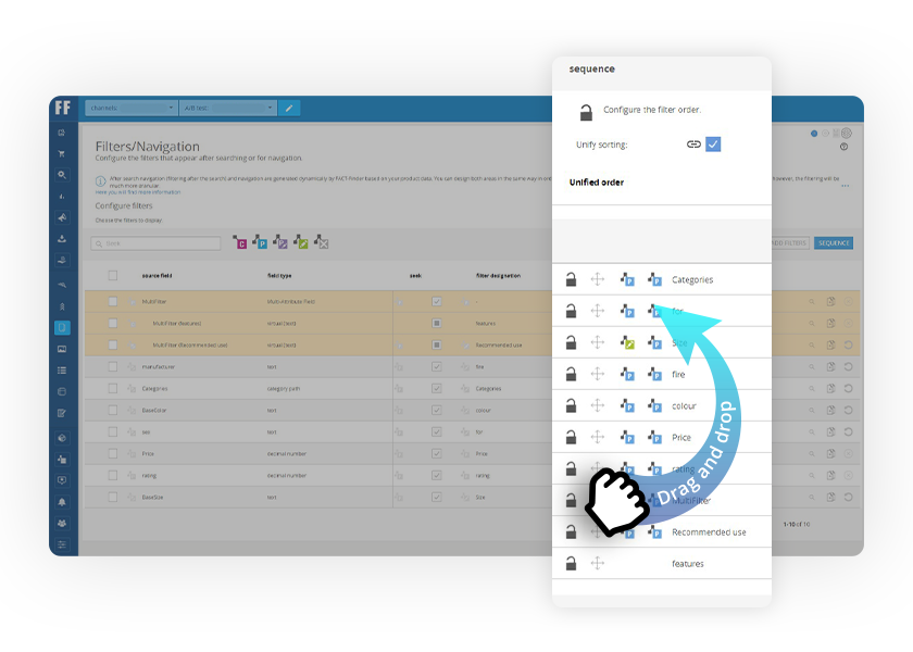 The FACT-Finder user interface strikes the perfect balance between automation and control.
Even if you know your assortment best, when arranging the faceted search, we recommend that you orient yourself on the click behavior of your customers. The frequency of use of the individual facets is a good indicator for determining the right order. In the FACT-Finder backend, you can see which facets and filters are used most often, under Analytics > Reports. Under Statistics in the menu, you can see exactly which facet groups and facet characteristics are clicked on and how frequent, by total number and the percentage distribution.
The order of the individual filters within a group is also crucial for good orientation. Basically, there are two proven options for this: One is the alphabetical or numerical listing, and the other is sorting by the number of hits (i.e., the number of product results that remain when the respective filter is activated).
Deciding which of the two makes the most sense is not always easy. While alphabetical sorting is clearly the easiest for brand filters, both could work for colors. In any case, our consulting experience shows that as soon as more than six options are displayed within a facet, it is worth considering alphabetical sorting, whereas, in the case of size specifications, numerical sorting should be used.
6. Do you offer click & collect? Then availability facets are a must
Forrester found that 78% of adult online shoppers think it’s important for retailers to offer product availability in-store on their websites, while 59% want the ability to buy online and pick up in-store. For services such as click & collect to work and be accepted by customers, they need supporting store functions – first and foremost, availability facets. These allow customers to narrow down the results to only products that are in stock in the nearest store. This is a huge help for anyone who wants to pick up their desired product directly from the store around the corner.
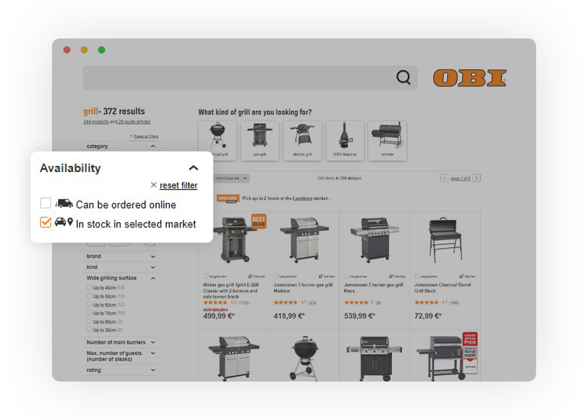 OBI makes it easy for visitors to filter results by products that are available nearby – a great USP within the DIY industry.
7. Optimize your faceted search for mobile
Insider Intelligence predicts that by 2024, mobile sales will account for 43% of eCommerce, pushing businesses to adopt a mobile-first mentality. The smaller the screen, the more important it is that the right content is displayed from the start. When it comes to faceted search, it’s best to reduce it for the mobile version. A proven guideline is five to seven facets per search results page or category page.
Another factor to bear in mind is that the mobile page should not reload after each individual facet selection. Depending on where you are and the data transfer rate, this could take up unnecessary time. In contrast to the desktop version, customers should first click on all the desired facets and then have the option of activating them with an ‘Apply’ button.
In the online stores of electronics giant Elkjøp Nordic, the conversion rate of facet users is 10% higher than the general conversion rate. Their eCommerce team has responded by focusing on optimizing the faceted search and making it more user-friendly for mobile customers. A simple change such as moving the most popular facets on the category pages to the top of the search results pages reduced the bounce rate by 4.19%, increased facet usage by 78%, and increased the conversion rate by 5.67%. Read Elkjøp Nordic’s journey to an optimized experience.
Another great success story in mobile optimization is Ahrens+Sieberz which increased mobile sales by 125% by making functionality on smartphones easier. Read Ahrens+Sieberz case study.
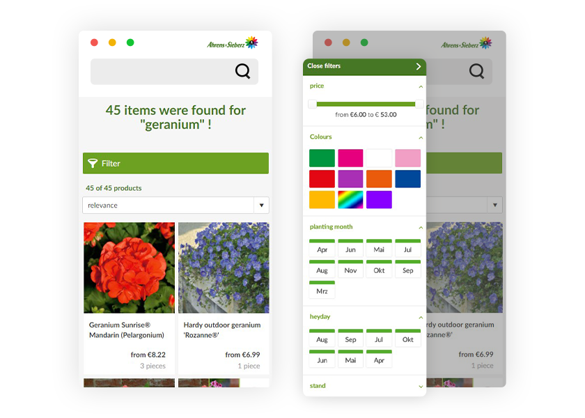 The mobile version of Ahrens+Sieberz displays only the most important facets relevant to the purchase – for example, price, color, and flowering time
Tip: Did you know that Google uses mobile friendliness as a ranking factor? Websites that cater to both desktop and mobile visitors see a significant impact on where they place. Click below to use Google’s mobile-friendly test and see where you stand.
8. Use facets for inspiration and advice
In principle, faceted search is there to narrow down extensive and diverse search results in a practical way, but it can also be used to inspire customers. For example, when a customer is buying a laptop, the faceted search can remind them of important criteria they may not have thought of yet such as RAM, video card and processor.
Another way faceted search can advise customers is through targeted questions, or as we call it, guided selling. It simplifies customers’ decision-making through a question-and-answer format. The questions are completely customizable and can be used to ask customers for their personal preferences regarding size, color, functionality – or anything else you can imagine.
Technically speaking, guided selling is not based on filters, but on FACT-Finder consulting campaigns. For the customer, however, the experience is very similar because the list of results becomes clearer with each click. One important difference is that to refine the results, you don’t have to be familiar with them. Rather, with guided selling, the questions are formed as if the online shop were a salesperson. This means that a customer looking for a TV isn’t asked to specify the size of the screen but how far from the screen they’ll be sitting.
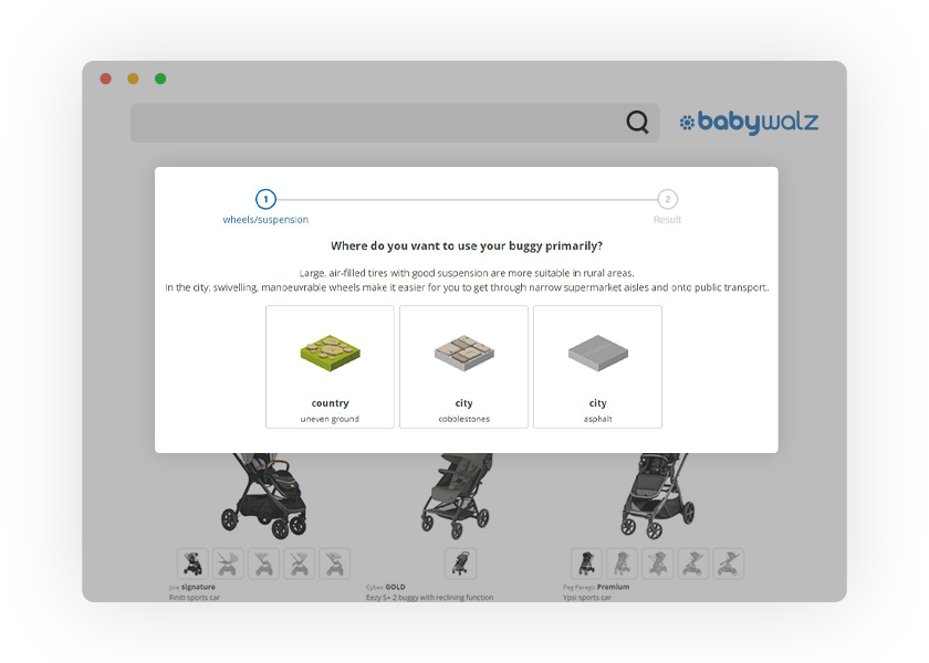 Guided selling helps Babywalz customers find the perfect product through interactive, helpful and intuitive questions.
9. Let your search solution set the right facets for you
Before closing, we’d like to give you a best practice that is not directly related to the display of facets and filters but rather to the intelligence of your shop’s search. If your search is capable of recognizing product attributes in search queries, your customers won’t need to click on facets. Of course, this only works for multi-word queries, and not for generic searches like ‘shoes’ or ‘computer’. But with long-tail searches, automatic recognition of attributes is a valuable aid that can speed up the customer journey while giving your customers the feeling of being heard.
A great best practice example is Walbusch. Their search engine recognizes product attributes in the search query and automatically applies them as corresponding filters – all without the customer having to do anything. Daniela Göd, online product manager at Walbush, explains, “Customers often search specifically for a shirt in a certain size or color. Therefore, we worked together with FACT-Finder, to implement a feature that automatically sets the appropriate filters when certain attributes appear in the search entry. This way, the customer receives a results page that exactly matches the product they wish to purchase. This increases the usability enormously.”
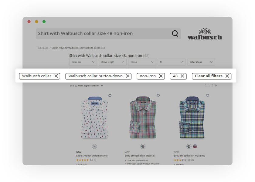 Walbusch delivers a truly intuitive shopping experience. Their search ensures customers don’t have to search and filter – it does both for them in one step.
In the B2B market also exist solutions that are redefining the way we filter. An example is Ratioform’s box finder which allows users to simply enter their desired package dimensions. The search engine will then deliver results that match the exact size as well as those that differ slightly. In addition, a green checkmark or red X mark helps users quickly identify which dimensions match and which don’t.
Finding the right product has never been more intuitive. Customers simply enter the sought-after dimensions and Ratioform’s search delivers packaging that come closest to the size.
Faceted search checklist ✔
Here’s a quick overview of all the best practices covered in this article:
1. Standardize your product data. By breaking colors down to the primary color and normalizing units of measurement, you lay the foundation for faceted search without duplication.
2. Apply interdependent rules. If you have a broad range of products, give your customers the option of making a pre-selection before you show them the very specific filters.
3. Add thematic facets. Put yourself in your customers’ shoes and offer filters that reflect their motives, occasions and purposes.
4. Use graphics and sliders. There are many ways to show filters even more clearly, with an even bigger appeal. It is definitely worth considering when it comes to colors and prices.
5. Arrange the order of facets. In order to find the best arrangement for the facets, you should analyze user behavior.
6. Integrate local availability facets. This is especially true for any business that offers click & collect. Availability filters make your location-based services even easier to use.
7. Optimize for mobile. This is one factor that is often neglected but presents great opportunities to set yourself apart from the rest of the market.
8. Inspire and advise. Guided selling can complement your faceted search, particularly when it comes to products that require explanation.
9. Enable your site search. If your search engine is able to take over the filtering, you’re on the right path to success.
Want to continue learning more about filters and faceted search? Then check out our blog post: