Welcome to this edition of thought leadership, where you can discover the latest eCommerce insights direct from industry experts. In this article, Aliyah Mörtl, eCommerce Consultant at FACT-Finder, walks you through how she audits digital shops to help you identify where you can improve the shopping experience and your revenue.
Online shops consist of various stops that a consumer will go through. However, along that customer journey also lie possible opportunities where a shop can mess up and drive possible customers away. To avoid that, we as consultants at FACT-Finder, help our customers optimize their online shops accordingly. Learn how we do it and what to look for in your online shop.
How to get started
The very first step when analyzing an online shop is to always do it from the perspective of a consumer. Yes, you know your product assortment, your categories and everything around it best but we want you to forget about that for a moment and just pretend that you are a possible customer that is browsing around. This will help you see things you might not have been able to catch before.
Now, as soon as you are in the right mindset, you are going to go through the whole customer journey. We are going to test out every single path visitors take to get to the checkout – because, in the end, the goal is to increase your conversion rate and thereby your revenue. With the right tools, you can maximize your revenue while also enhancing your customer relationships and loyalty. So, let’s start auditing!
▶ Watch a live shop analysis
Ever wondered what your eCommerce competitors are doing right or wrong? Join me and my colleagues as we execute digital shop audits on some of Europe’s biggest retailers.
Customers take different paths to get to your products
The very first impression of your shop is the homepage. Of course, each page looks a little different in its structure, color, theme, and content – either appealing to the potential customer or not. Naturally, you won’t be able to fit everyone’s personal preferences and tastes, but it helps to follow some general patterns which can include placing banners with current promotions, relevant content and top-selling products.
Then, consumers will choose one of three ways to further enter your shop: via the search, suggest menu, or navigation. And this will most likely just depend on each person’s habits and preferences. In your shop audit, however, you will want to go through each of these to check all your current functionalities.
For the navigation, it makes sense to define clear categories that don’t use combined categories, since this could lead to mixed and unclear search results later.
Analyze: Go ahead and check your navigation categories. Are they structured in a way that most people can find what they are looking for? Do they give visitors an overview of your product assortment?
Concerning the search, the bigger and more prominent the search bar, the better. That way consumers will be encouraged to use it more frequently. You might even consider adding some sort of call to action in the search bar or around it.
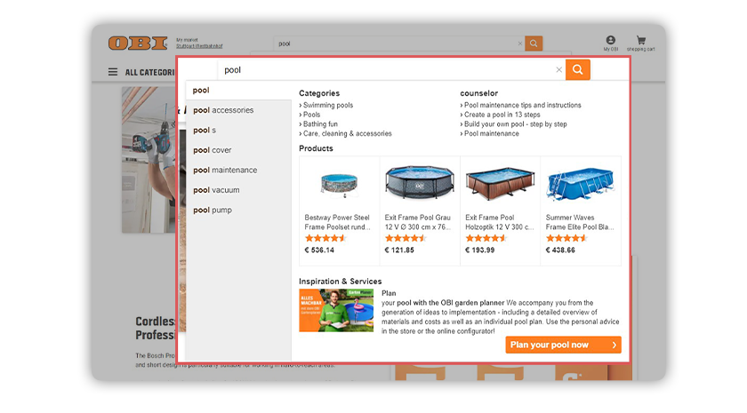
The suggest function is an important component for determining search suggestions. The advantages of the suggestions result entirely from the fact that customers get to the desired products even faster and thus the purchase is accelerated, and, in turn, sales are boosted, since customers are also shown products that they might not have considered before. But what does a good suggestion look like?
It is always great to offer several suggestion types, such as search terms, products and categories. Brand and content suggestions might also be an option depending on your assortment. Generally, this creates a great basis for a suggest menu. Another thing worth mentioning is additional information that could be added to the product suggestions. This can be, for example, adding product images directly in the suggest menu which helps consumers visualize the products faster. Adding price, ratings, article numbers, other information or even an add-to-cart button can also boost your sales.
 This online shop is a great example of a suggest menu done right.
Now that we’ve checked each of these entry points, next comes the product overview page. So, let’s see what you need to keep your eyes open for here.
Partner insights
In order to fully understand your customers, you need to grasp all touchpoints in the customer journey. If you are the visual type, we recommend using this interactive Customer Journey Map Template. It helps you identify and understand each and every path visitors are taking on your entities and is a valuable first step to get going with your audit. Once you have understood the way your customers interact with your content, it is time to consolidate all data in a Customer Data Platform (CDP) and have it available for all future marketing activation. Mapp Cloud offers full CDP functionalities – and then some! Check out Mapp Cloud here.Esther Lago MéndezPartner Marketing Manager at Mapp Digital
How to analyze your product results page
Whether you have entered a search or navigation result, you will get an overview of potential products that hopefully fit your needs. Let’s focus on the results first.
Analyze: Looking at your your search results, do they meet your expectations? How are they ranked? From a business perspective, would you rather push other products to the top of the result?
Users look at the product result list for about 6.5 seconds, perceive about 4 entries and expect to find everything that is important to them in the first positions of the search results. Therefore, product ranking plays a crucial role on the search results page and contributes considerably to revenue generation.
Overall, according to our experience, it can make sense to push new products, high margins, best ratings, top sellers and rarely returned products to the top of the results. While products that do not have pictures or are out of stock should rather be last in the result or be cut out completely. It’s important that you define the right strategy for your rankings. If you have some sort of annual or other timely occasions, you can also push specific brands or products in the navigation or search result.
Another way to enhance your search result page is the use of digital merchandising campaigns. These can either be used as banners or other media to build generic landing pages or for advertising purposes in between the products themselves. Furthermore, you can highlight specific products in a carousel on top of the results. This can also be helpful to direct customers from zero-result pages to other product options.
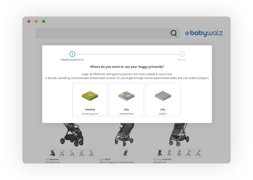
For more generic searches, it is also advisable to make use of guided selling campaigns that work as a “salesperson” through simple, pre-formulated questions and answers. These will lead your customers to their desired products without having to know much about the product itself as well as possible features that can be found in facets.
 A generic search for ‘buggy’ or ‘stroller’ can either lead to a long list of results or to a helpful guided selling campaign.
Speaking of facets or the so-called After Search Navigation (ASN), filtering options can also play a big role in getting to the right product fast – therefore increasing customer satisfaction and sales. They are used when customers want to narrow their search further. Generally, these filters should be easy to find and use for your customers for example through a clear structure that aligns with your product data since filters are usually based on product attributes. Another possibility to increase ASN usability is the implementation of preview pictures for filter elements like colors or making use of sliders for numerical filter attributes like prices.
Analyze: Take a look at your facet options for different search and navigation results. Would you be able to filter the results in a way that will lead you to your desired product? Are the filters easy to find and use? Are you able to select different filters at once? Or can you just work with one filter at a time? As you can probably tell, a lot of features and possibilities go into the ASN, but it is worth taking a closer look at.
After reviewing your product results page for ranking rules, campaigns, and filters, we will now pretend to have found a product of our liking and go into the product detail page.
How to enhance your product detail page
On the product detail page, your customers should be able to find lots of relevant information about the specific product they are looking at.
Analyze: Ask yourself: Do I have good images giving customers a 360° view of the product? Do I maybe display videos showing the product? How about the description and the information I deliver in general? Are customers able to find all relevant information and do they help them make a buying decision?
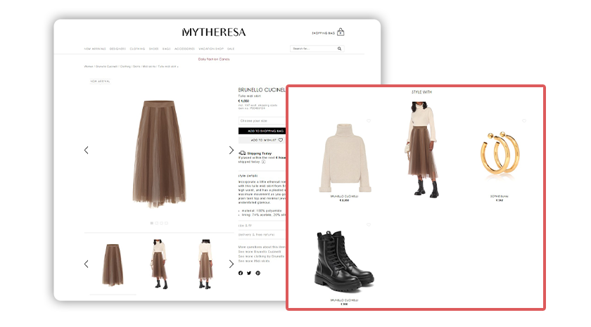
Furthermore, you might not only want to convince potential customers to buy a specific product but possibly also similar ones or necessary accessories. You could also make use of upselling or cross-selling here. A good way to do so is by using recommendations on the product detail pages. There are different ways to recommend other products. For example, “similar products” consist of products that have the same features as the category, brand, or color, whereas “other people also bought” recommendations show products based on recorded purchases of all customers. Additionally, campaigns can also be used on the product detail page to add any sort of feedback or media to push your marketing activities.
 Recommending complementary items on the product detail page is a win-win for the customer and your shop.
As soon as your customers have found their desired product, they will go on to put it in the shopping cart – which leads us to the last step of our shop audit.
Never underestimate the power of a shopping cart
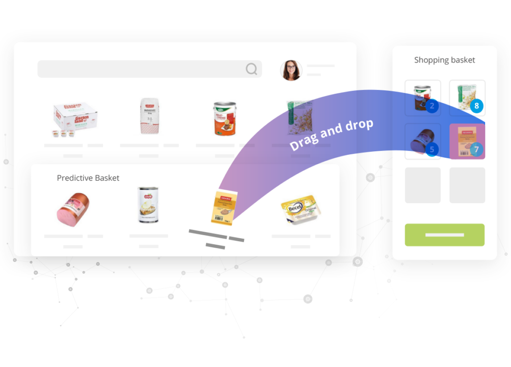
The shopping cart will be the last opportunity for you to increase your sales by getting your customers to stock up on other products they might also want to buy. As for the product detail page, you can also integrate recommendations in your shopping cart to show products to your customers that they might also be interested in buying. Another possibility is to predict their basket through previous purchases they have made. This can also push your sales immensely.
 Predicting products a customer needs but may have been forgotten is a guaranteed way to deliver a wow experience and maximize sales.
Overall, you want your customers to check out instead of using the shopping cart as a parking space for products they like. Therefore, it is great to ensure different payment and shipping methods to increase the satisfaction of possible customers and then convert them to actual customers.
And there you have it. You’ve just successfully audited your online shop. Good job!
If you have any questions on how you can improve your online shop or would like to have a professional opinion, feel free to contact my team at consulting@fact-finder.com. We would love to show you how to increase your conversion rate and professionalize your online shop with FACT-Finder.
About the author

Aliyah has extensive eCommerce knowledge and international practical experience. After working in B2B and CRM marketing, she spent several years with a German-French cosmetics company, where she developed valuable industry knowledge. Her academic career led her from international business studies, with several years spent in the USA, to a Master of Science in Dialog Marketing and eCommerce.
For more eCommerce insights, connect with Aliyah on LinkedIn.